

How to mix patterns without overwhelming a room
Mixing patterns can make a room feel personal, layered, and full of energy. Yet without a clear plan, stripes, florals, checks, and abstract prints can quickly compete for attention. The aim is not to make every surface equally expressive. Instead, you can create a room where each pattern has a role, while colour, scale, and texture keep the overall scheme calm.
Begin with a palette that connects every pattern
A shared colour palette gives different prints a visual relationship. You do not need every pattern to contain the same three colours, but each one should echo at least one shade already present in the room.
For example, a navy-and-cream striped sofa can sit comfortably with botanical cushions that include navy leaves, soft green, and a touch of cream. Add a rug with a faded terracotta detail, then repeat terracotta in a lamp base or framed artwork. The room gains variety without looking fragmented.
Choose a foundation of two or three main colours, then add one smaller accent. Neutral shades such as ivory, warm grey, taupe, or charcoal are particularly useful because they provide breathing room between bolder prints.
Use different pattern scales to create balance
The most reliable way to avoid visual overload is to vary the size of your patterns. A large-scale print needs space around it, while smaller motifs work best as supporting details.
Try a simple hierarchy:
- One dominant pattern on a large item, such as curtains, wallpaper, an area rug, or an upholstered headboard.
- One medium-scale pattern on cushions, a chair, or a throw.
- One or two smaller prints on accessories, such as a lampshade, table linen, or decorative box.
A wide floral wallpaper, for instance, pairs well with a medium check and a fine pinstripe. What matters is contrast in scale. Two oversized, high-contrast patterns placed side by side often feel competitive, even when their colours match.
Let solids create moments of rest
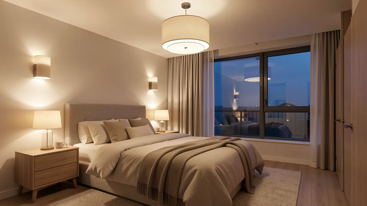
A room full of print from floor to ceiling can feel tiring, particularly in a bedroom or small living room. Solid-colour surfaces help the eye pause and make your chosen patterns appear more intentional.
Use plain upholstery, painted furniture, neutral walls, or simple window treatments to separate busier elements. If you have patterned wallpaper, consider a solid sofa. If your rug is richly decorated, choose quieter cushions and curtains.
Texture can offer richness without adding another motif. Linen, boucle, velvet, rattan, wood, and woven wool all bring depth to a scheme while keeping the visual rhythm under control. Texture is often the quiet partner of pattern.
Combine pattern families with a clear point of view
Some pattern combinations naturally feel more relaxed than others. Florals and stripes have long worked well together because one is organic and the other is structured. Checks can add a tailored note to softer botanical or painterly designs. Geometric prints can also balance more fluid shapes, provided the colours remain connected.
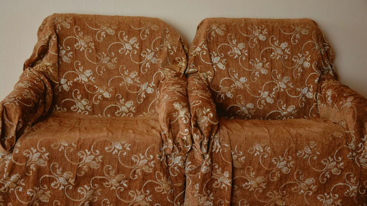
When choosing unfamiliar combinations, start with a common mood rather than a strict matching rule. A faded floral, a hand-blocked stripe, and a vintage-inspired check can work together because they share a lived-in, artisanal character. By contrast, a glossy graphic zigzag and a delicate antique-style chintz may need a stronger linking colour or a neutral buffer.
For inspiration on how decorative styles have developed across periods and materials, the Victoria and Albert Museum’s pattern collections offer useful visual references.
Repeating a motif can make the scheme feel intentional
A repeated shape creates cohesion even when the prints themselves differ. You might combine a curved floral with a rounded scallop border and a circular spotted cushion. Alternatively, use angular patterns together, such as a grid, a narrow chevron, and a diamond motif.
This does not mean every print must match. Repetition simply gives the room a subtle design language that ties separate pieces together.
Start small when you are testing bolder combinations
If you are unsure about mixing patterns, avoid committing first to expensive upholstery or permanent wallpaper. Cushions, throws, tablecloths, removable lampshades, and small rugs allow you to test combinations with less pressure.
Lay fabrics together before buying them. View them in daylight and in the evening, since artificial light can alter how colours relate to one another. Take a photograph from several steps back. A combination that feels busy when examined closely may look balanced from across the room.
You can also group patterns within one zone. A patterned armchair, cushion, and side table vignette can become a contained focal point, while the rest of the room remains quieter. For further decorating ideas that use overlooked spaces thoughtfully, see Creative ways to style empty corners.
Make your largest surfaces work hardest
Large patterned pieces set the emotional tone of a room. Before adding smaller decorative prints, decide whether your main statement will come from the walls, floor, curtains, or a major upholstered item.
If you choose patterned wallpaper, keep the rug and sofa relatively restrained. If a dramatic Persian-style rug is the centrepiece, let it guide the colours of surrounding textiles. A striking curtain fabric can be softened by plain walls and furniture with clean lines.
One confident focal point is usually more effective than several competing statements. You can still layer personality through smaller objects, but the room will feel easier to read.
Create a layered room that still feels calm
Successful pattern mixing is less about following rigid formulas and more about editing. Build around a shared palette, vary the scale of motifs, and include solid surfaces that give the composition space to breathe. If a room starts to feel crowded, remove one print before adding another neutral element.
Keep these principles in mind:
- Link patterns through at least one shared colour.
- Mix large, medium, and small motifs rather than repeating the same scale.
- Balance expressive prints with plain surfaces and tactile materials.
- Choose one major focal pattern for the room.
- Test bolder combinations first with removable accessories.
- Repeat a colour, shape, or mood to create visual cohesion.
With a measured approach, patterns can make your home feel collected rather than cluttered, giving each room a distinctive character that still feels comfortable to live in.